Chapters: A Bold Display Font for Web Design Projects
I was staring at a hero section that needed more than a predictable heading. The creative portfolio I was redesigning for a visual artist felt too safe, too polished. The brief called for something raw, immediate, and slightly unsettling — a typographic voice that could stop a visitor mid-scroll. That’s when I loaded Chapters into the project and dropped it onto a full-screen dark image banner.
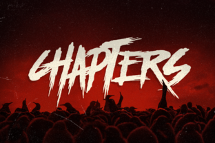
The change was instant. The font’s jagged, distressed letterforms snapped into place, carrying an apocalyptic energy that matched the artist’s mixed-media work. It wasn’t just a typeface; it was a mood. As a web designer, I’m always looking for display fonts that can hold a layout together without overwhelming the rest of the page, and Chapters immediately felt like a strong candidate for this kind of high-impact digital branding.
First Impressions on a Dark Hero Banner
I placed the portfolio’s main headline — “Work That Leaves a Mark” — in Chapters over a black-and-white photograph with heavy grain. The font’s bold, almost stencil-like shapes cut through the texture without getting lost. The spiky serifs and irregular edges gave the text a hand-hewn, post-industrial feel that felt completely organic next to the imagery. On a dark background, the white lettering popped with striking contrast, but I noticed the finer details — like the hairline fractures inside the letterforms — remained visible even at smaller hero sizes, which added depth without turning into noise.
I also tested the headline on a light background to see if the font would lose its edge. Surprisingly, Chapters kept its personality. The rough textures translated well against cream and off-white, making it a versatile choice for campaign landing pages or editorial-style blog headers where you want to inject a bit of tension without relying on a dark color scheme.
How Chapters Handles Responsive Headlines
Like any display font, readability at smaller sizes is the first real test. I resized the browser window to simulate a mobile viewport and immediately saw that the font’s tightly packed letterforms needed generous letter-spacing when scaled down. At 32px and below, some of the narrower characters started to blur together, especially on lower-resolution screens. I applied a small amount of CSS letter-spacing — about 0.5px — and switched to a slightly larger breakpoint for the hero headline on phones. That kept the texture intact while ensuring the words remained legible.
For secondary headings and section titles, I used Chapters at sizes above 40px, where the font’s details really shine. On a coaching website I was also prototyping, the phrase “Break the Pattern” sat in a full-width strip above the fold, and even on a 375px-wide screen, the headline commanded attention. The key was avoiding long strings of text. Short, punchy phrases gave the font room to breathe, and the visual weight of each letter did the heavy lifting in terms of hierarchy.
Balancing a Display Font with Readable Body Text
A font like Chapters can’t carry an entire website. Its apocalyptic, spooky character is meant for emphasis, not for paragraphs. I paired it with a clean sans serif font — Inter — for body copy, captions, and buttons. The neutrality of the sans serif let the display font’s aggressive personality stand out without turning the reading experience into an assault on the eyes. On a product landing page for a limited-edition apparel drop, the combination felt confident and curated: the headline screamed urgency, while the product descriptions stayed smooth and scannable.
For a more editorial direction, I also tried pairing Chapters with a classic serif font like Lora. The contrast between the refined, literary serif and the distressed display type created a layered, magazine-like atmosphere. This worked beautifully on a blog redesign for a culture publication, where feature titles needed to feel both intellectual and rebellious. The key is restraint: use Chapters for one or two hierarchical elements per page, and let the rest of the typography support that decision.
Where Chapters Shines in a Real Layout
Over several projects, I found that Chapters excels in specific digital contexts. On a boutique online store’s homepage, I used it for the seasonal collection banner — “After Hours” — and the rough, almost handwritten edges gave the brand a tactile, underground feel that no smooth geometric font could replicate. On a course sales page, the font worked as a section opener, announcing modules with phrases like “The Breakdown” or “What You’ll Unlearn.” The bold, high-contrast shapes naturally draw the eye, making it easy to guide a visitor’s scanning behavior down the page.
It also found a place in a digital brand kit I was building for a music producer. The font’s logo-ready aesthetic meant it could be used sparingly on social media graphics, YouTube thumbnail text, and even email headers. Because it’s a premium font with a distinct personality, it helped the brand stand apart from the sea of generic sans-serif identities that dominate digital spaces.
Typography Consistency Across Pages
When using a display font with such a strong character, consistency is everything. I set up a simple typographic scale in the design system: Chapters for H1 and H2 on desktop, with a fallback to a heavier sans-serif weight for smaller headings on mobile if performance became an issue. The font’s web version came in WOFF and WOFF2 formats, which kept file sizes manageable and load times fast, even on image-heavy pages. I preloaded the font file to avoid a flash of unstyled text, and the experience felt seamless during testing.
I also checked the font’s included styles and alternates. Chapters offered a few alternate glyphs that added extra flair — like a double-story ‘g’ and a more fractured ‘R’ — which I used sparingly on the portfolio’s about page and in the site’s footer quote. Small touches like that make a brand feel bespoke without requiring custom lettering work.
What to Check Before Using Chapters on a Client Site
Before committing any commercial font to a live project, I always go through a quick checklist. With Chapters, I started by verifying the webfont support and the commercial font licensing. The license allowed use on a single website with a reasonable pageview limit, which covered the portfolio and the boutique store without extra fees. It also permitted use in digital templates and social media graphics, which was important for the brand kit project.
I also tested the font on different backgrounds. Over gradient overlays and semi-transparent image layers, the font remained readable as long as the contrast ratio stayed above 4.5:1. On small buttons, however, I avoided it entirely. The font’s texture demanded size and space, and shrinking it to 14px inside a CTA button turned it into a muddy mess. For buttons and navigation, I stuck with the simpler sans-serif, which actually reinforced the visual hierarchy — the decorative font became a landmark, not a crutch.
Multilingual support was another practical consideration. The font covered basic Latin characters and some diacritics, which worked for English, Spanish, and French copy. For a client project that needed Cyrillic or Greek, I would have needed a fallback plan, but for the majority of web design work, the character set was sufficient. I also noted that the font’s distressed texture is consistent across uppercase and lowercase, which makes all-caps headers feel particularly cohesive.
Thinking Beyond the Hero Section
While Chapters is a natural fit for hero titles and landing page headers, I found it just as useful in unexpected places. On a promotional landing page for a Halloween-themed digital event, the font appeared in countdown timer digits and as a watermark behind the registration form. The spooky, apocalyptic vibe felt authentic rather than forced, and participants commented on the cohesive design language. On a creative portfolio, I used it as a large, low-opacity background element behind the project grid — a subtle brand signature that didn’t interfere with the navigation.
For digital product creators and course designers, this font can add a cinematic, almost narrative quality to a sales page. A headline like “The End of Average” in Chapters immediately sets a tone of transformation and urgency. It’s a modern typography choice that speaks to a generation of online audiences who value authenticity and edge over sterile perfection.
In the end, Chapters became a go-to in my design toolkit for projects that need to feel bold, story-driven, and unapologetically different. It’s not a font for every client, but when the brief asks for a creative font that can anchor a brand’s visual identity, it delivers. The key is using it with intention — respecting its display-only nature, pairing it with clean body text, and always testing it across devices and backgrounds. When you do, you get a typeface that does more than just label a page; it becomes part of the narrative.